🔷 ACM Membership Portal Redesign
Redesigning the way 1000+ members interact with the ACM UC San Diego Membership Portal
Association for Computing Machinery (ACM) was the first student organization at UC San Diego to create an in-house membership portal. It is now used by 1000+ members within ACM’s first year since founding. I was part of an ACM Design team project to redesign and create new features on the ACM Membership Portal for UC San Diego’s largest technology organization.
I was part of an ACM Design team project to redesign and create new features on the ACM Membership Portal for UC San Diego’s largest technology organization.
View my full case study article on Medium.
The challenge
The first membership portal was created when there were no existing users, design team, or design standards. After a year of deployment and the creation of ACM Design, I had the chance to reflect and strategize an improved membership portal. I wanted the redesign to be centered around fluid experience navigating through the portal and fun engagement to keep members coming back. This brought me to the blanket problem statement:
How might we design a more engaging membership portal for meaningful, fluid, member interactions?
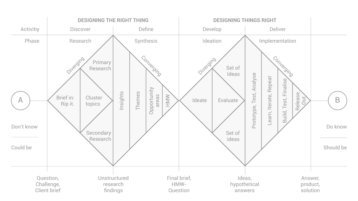
Design process: The double-diamond
We followed the double-diamond design process, diverging in our user interviews and prototypes and converging during two Design Jams per week to discuss results, make design decisions, and design together.
Initial user research: Discover member motivation
I wanted to find clear paths to set for focusing on feature design.
My research goals were to:
- Identify how the portal has contributed to the ACM community
- Discover user motivation for using the portal
- Uncover user pain points
Surveys: Discovery
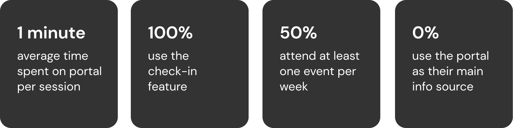
I began by surveying volunteer users on the original membership portal user interface. Here are some of the key user statistics from the survey:
Interviews: Deeper insights
I then spearheaded interviewing members that took the survey to try to get qualitative answers to the survey statistics. Here is some of the key feedback received:
There should never be a point where someone can’t find something ACM-related or has to ask about it — Sumeet
I wish members could have their own pages to host their own content — Ronak
It would be nice to have feedback forms. Members like to be heard — David
Competition is good. People at the top of the leaderboard make others want to compete with them— Ivy
Reframing the problem
Based off of the survey statistics and the interview feedback I drew some conclusions:
- Events with check-in codes are the heart of ACM portal engagement
- Since members spend ~1 minute on the portal and all members use the check-in feature, that is enough time to enter the check in code and confirm success but nothing more
- At least half these members are attending events therefore interacting with the portal but it is not engaging enough to be used for more than check-in
- The leadership board the second main source of membership portal’s interactivity between fellow members but only for those at the top
- Members want connection and the ability to give feedback
Springing off the original problem statement to new goals, three key design challenges emerged:
- How might we improve member connection and contribution?
- How might we centralize ACM information?
- How might we create seamless event interactions?
Let’s make this portal redesign the talk of the down — Jack, fellow designer
We want it to be the one-stop-shop ACM hub — Amy, fellow designer
Ideation and wireframes: Opportunities to improve
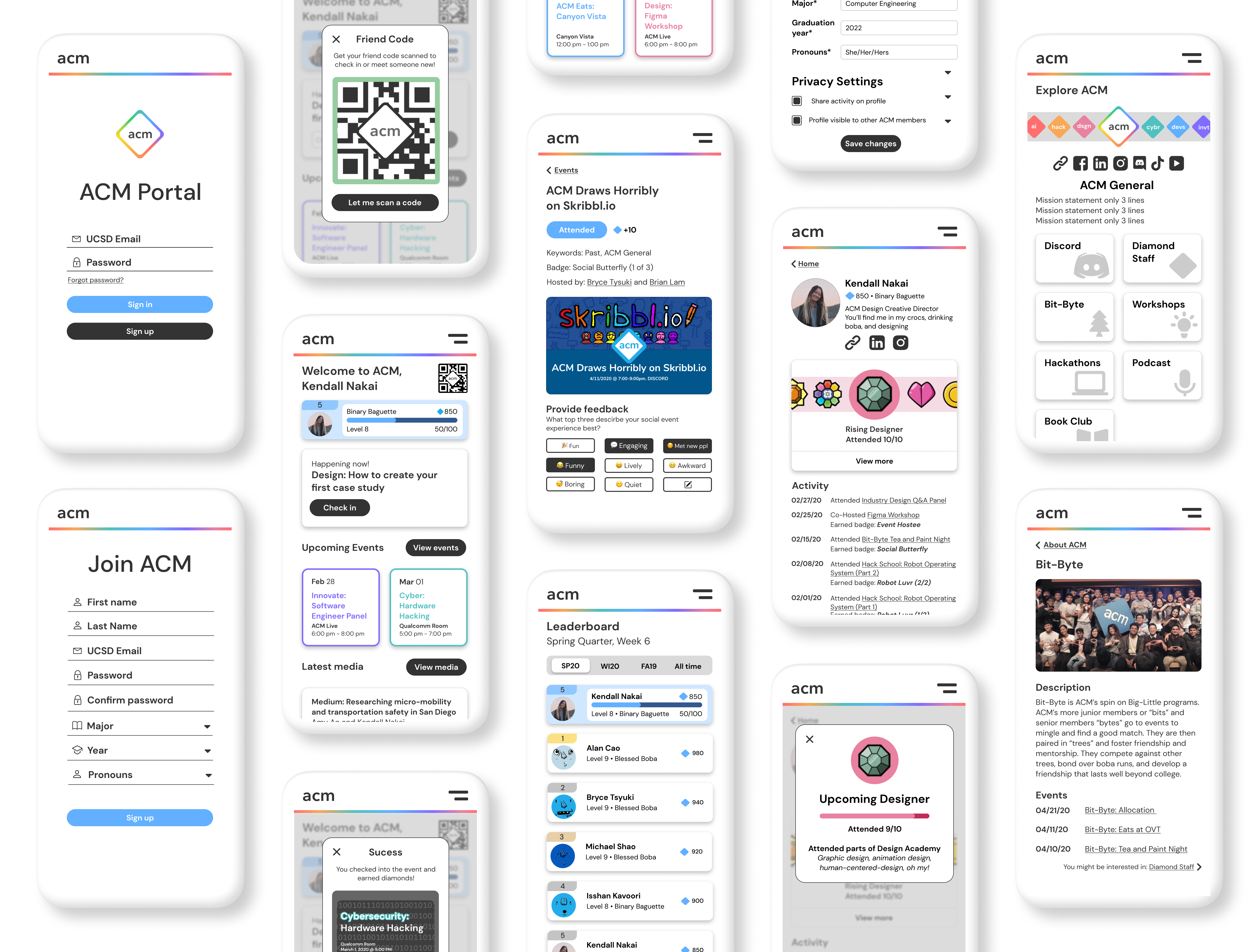
The features of the original portal were Profile, Event check-in, Events, Leaderboard, About ACM, and a link to our Discord.
We wanted to retool these and create new features to initiate member engagement. I kept my personal goals of member experience and efficiency at all stages of looking for opportunities to improve the design.
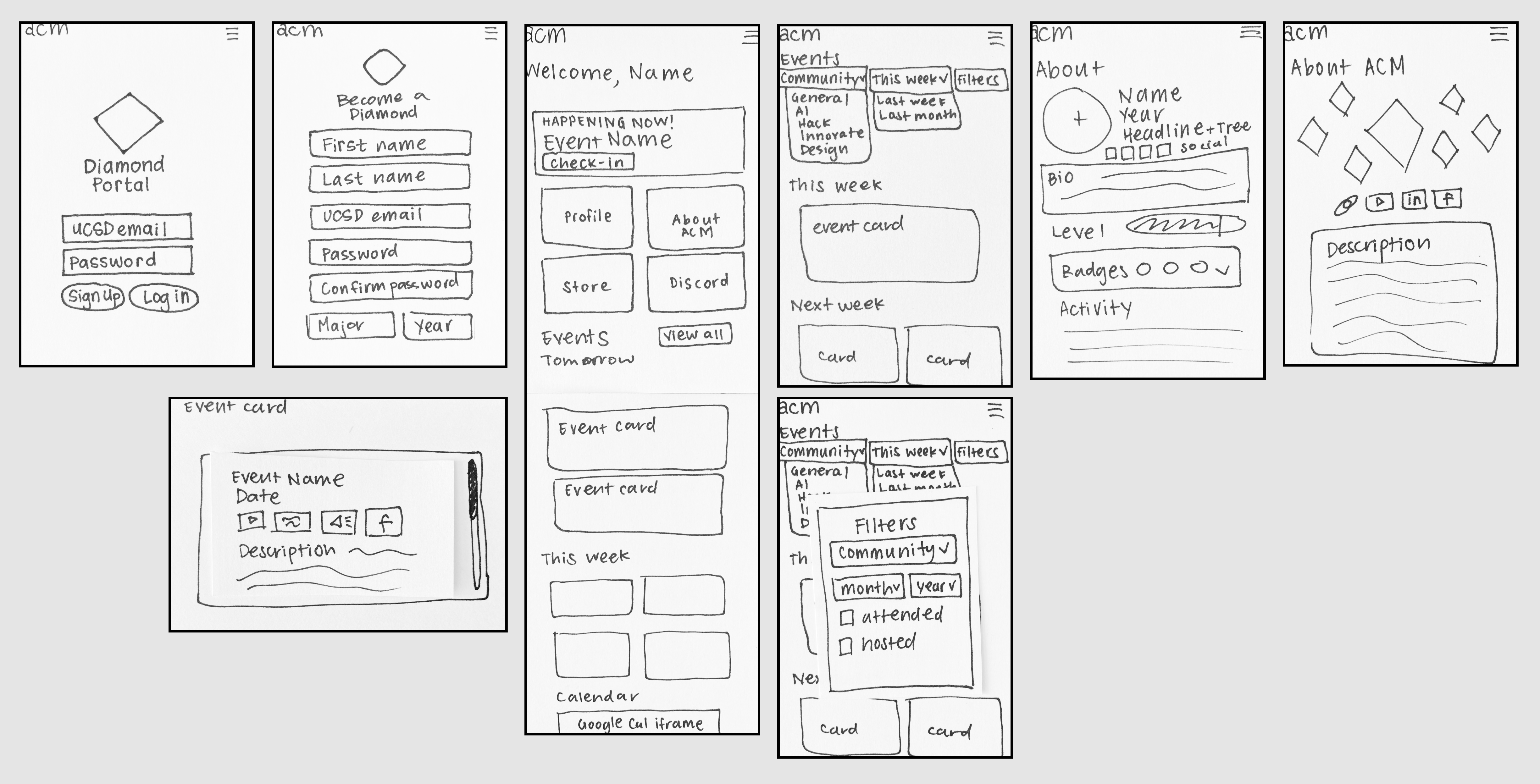
Ideation into implementation: The membership portal redesign process
The membership portal redesign was a passion project and labor of love for the members ACM. Here were my key feature changes based on issues I found in user testing and membership portal data:
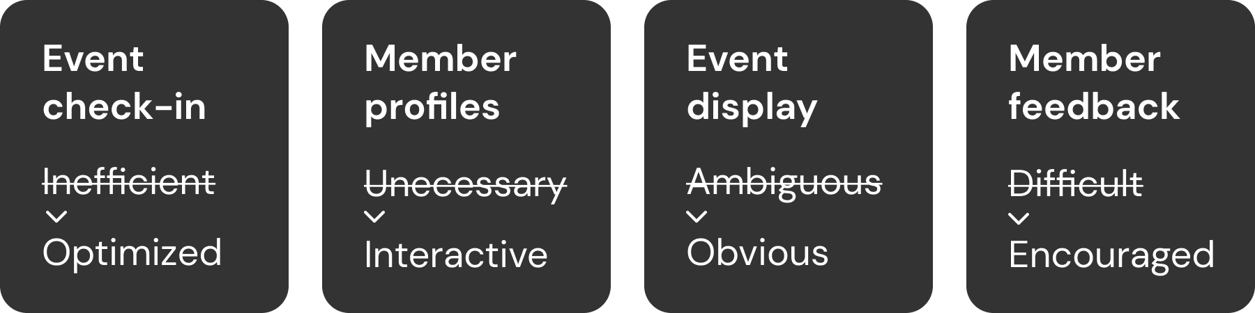
Event check-in: Creating an optimized experience while connecting members
When members attend events, they are able to check-into events through the portal. This check-in enables ACM to continue hosting events and is required by UC San Diego for ACM to receive funding from the school.
I found it takes a minimum of 8 taps and typing and a maximum of 22 taps and typing to go from a locked phone to a logged in/registered and checked in member.
ACM hosted 131 events with 3481 portal check-ins and 5125 estimated actual attendees during the 2019–2020 year leading up to the redesign. That means potentially 32.1% of attendees do not check in.
I concluded members were likely to not check in because:
- They did not see the check-in code
- They do not have an ACM account
- It is overcomplicated to check-in
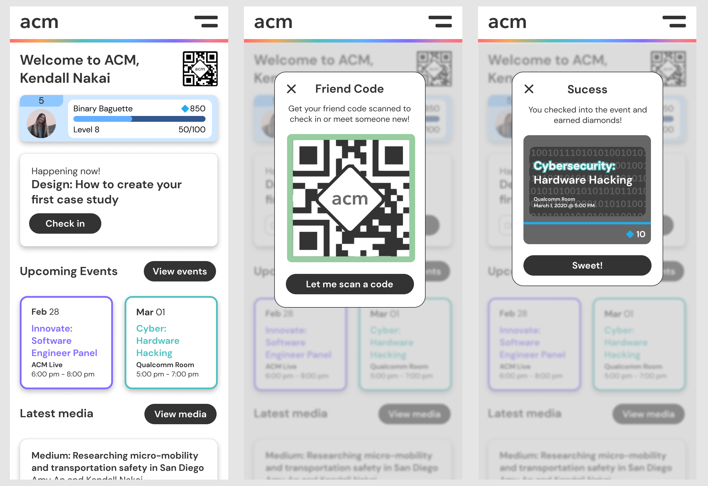
Based on these insights, I proposed a new way of checking in and interacting with members through individual QR codes.
Individual QR codes, or buddy codes would improve member initiation, engagement, experience, and retention because:
- There would always be someone to greet members at the door and check them in
- If an event was a person’s first time interacting with ACM there would be someone there to introduce them to the portal
- There would be reduced friction of typing in a code instead check-in would be scanning a code
Member’s experience begins from the time they come to their first event. I want to inspire their confidence in being rewarded for attending in addition to what they gain from actual events. At the moment, people are mainly ACM returners at events. Since this check-in process is routine, I worry that someone who’s first time it is at an ACM event could feel left out.
Picture this: a person is coming to their first ACM event as a first year college student. They are not quite sure what to expect but are brave enough to come out. They walk up and someone from ACM warmly greets them and asks them to pull up their buddy code. They ask “what buddy code?” The ACM representative replies “oh is this your first event? Let me explain the membership portal to you…” This is a vastly different experience than potentially being ignored when walking into an event and not understanding where to input a check-in code.
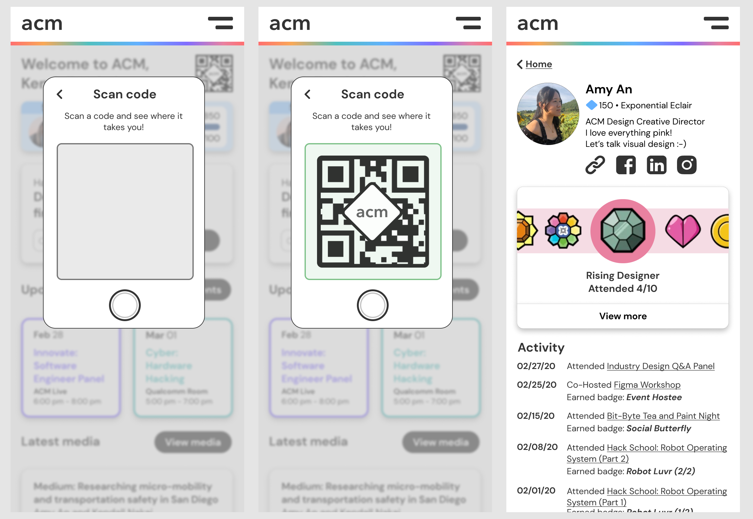
Furthermore, buddy codes could bring members together. Since buddy codes represent individual profiles, it could scannable. Members could scan each other’s codes and bring up profiles to see badges, contact info, and what they do in ACM. This could add a touch of sociability by:
- Increasing friendly competition for the leaderboard and earning badges
- Making it easier to get to know somebody by having buddy codes as an introduction piece
- Making meeting people an activity (i.e. “Hey everyone meet 10 people around you by scanning buddy codes and you will receive diamonds to spend in the ACM Store!”)
Some points brought up against checking every person in at a time was that it would make it slower to get into large events or the person checking people in might have a camera malfunction. In this case, the event check-in code would be a QR code as a backup and could be scanned just like a buddy code.
Final reflections: Always improving
This was the largest project I have taken on and I hope there are many more like this to come. Designing the ACM Membership portal was fun, friendship-building, messy in the best way, and challenging. Most of all, I learned a lot while making an impact on ACM. Here are my key takeaways:
- Collaboration brings together and creates ideas beyond what an individual could ever create their my own
- Letting go of ego is required for taking constructive critisism. On that note, ask anyone and everyone for feedback and absorb it all!
- Having a development team accompanying a project is priceless since they can give feedback on how feasible a design's implementation is
- Do not be pixel-perfect until the end! Empathize, design, iterate! Be willing to start-over!
The ACM Membership Portal redesign my child. I going to nurture it for far longer than the three months I did of it's infancy. As the ACM Design team and I hand it off to development team we will work together more to evolve and polish the mobile visual and functional design to make it the most seamless member experience possible. We will also design a responsive accompanying desktop version and admin version.
If you would like to view the original membership portal, feel free to at members.acmucsd.com. The membership portal redesign will be released in December 2020 so check back then!
It will be amazing to see the ACM Design team's work brought to life: a complete redesign and rebuild. I hope it will bring positive impact, engaging the 1000+ members of ACM in a friendly and fun way.
There's more to read in my process! View my full case study article on Medium.