Yelp Messaging Redesign
Evolving Yelp’s messaging feature into a more engaging experience through group polls and clickable restaurant cards.
Introduction
I collaborated alongside a team of three in the course, Data-Driven UX/Product Design to research, design, extend a feature to and redesign the popular mobile application, Yelp. After reading the Atlantic article, “The Important of Eating Together,” the team was motivated to target our extension and redesign toward encouraging people in one’s surrounding area to get together in-person and physically interact in a meaningful way. With the help of Yelp, the interaction would be through a meal.
Problem Statement
Friends need a more efficient and engaging way to coordinate which restaurant to meet up at and eat out together.
User Research
My team and I were interested in expanding on the Yelp messages feature to encourage friends to get together to enjoy meaningful experiences. Through user research, we set out to figure out what we could create.
Research Goals
- Determine the Yelp usage and demographics of Yelp users (not shown)
- Identify what Yelp users utilized Yelp for and the pain points of their usage
- Find out features Yelp users would be interested in to mitigate pain points
Research Methods + Findings
I wanted to utilize multiple methods of research to collect both a large quantity of data as well as specific quality user interactions.
- Survey
- Interview
- Direct observations
Survey
My teammates came up with questions to ask users and I translated the questions to a survey using Google forms. We mass distributed the survey via website link among local students and city residents and I sent the survey to Facebook food groups. This allowed a large set of people to share their Yelp experiences.
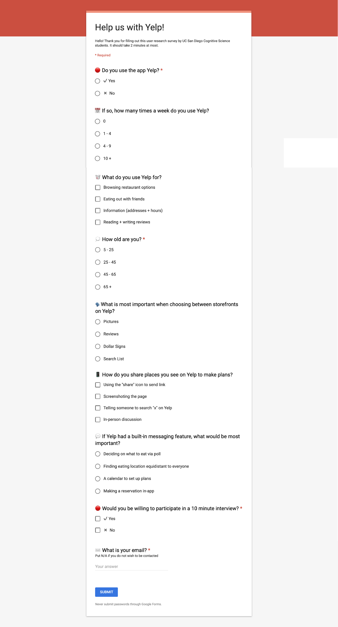
I paid special attention to how easy the survey was to understand, how many clicks or keystrokes a participant would input, and overall how long the survey would take to ensure no participant would get frustrated from the length. The email field was the only one that involved typing. To add to the survey visuals I put in emojis.
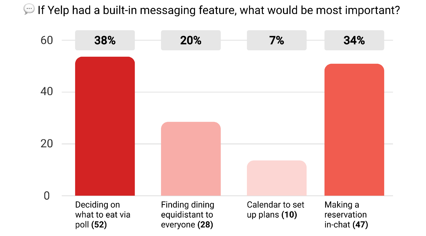
The survey received 150+ participant responses. Reviewing the data, I found at 38% of participants, there was the most interest in a poll feature on deciding where to eat. Trailing, 34% of participants had an interest in making restaurant reservations in-chat.
Interview
Each team member conducted three one-on-one interviews with the survey participants, totaling nine interviews. We wanted to dive deeper into how these Yelp users interacted with the strengths and shortcomings of Yelp in its current state.
One of the questions we asked was how long it takes users to decide where to eat with their friends.
Seven out of nine participants estimated it takes them over 10 minutes (individually) to decide where they would like to eat if they do not already have a restaurant in mind. With a group, the time is even longer.
“It takes way too long…probably like 30 minutes…It’s frustrating.”
Another question asked was what form of communication participants use to discuss where to eat. The complexity and amount of communication ranged, but overall we found participants usually have to go through multiple forms of messaging to confirm plans. From copying and pasting Yelp links to sending addresses, to calling on the phone, the number of different ways to communicate where to eat added up.
I talk with them on the phone or in person if applicable, then follow up with a text message with the name and address of the place. If we need to choose, I call them and discuss, then text to verify the selection and provide address and directions, possibly with a map link if needed.
Peeling through Yelp ourselves the team found Yelp searches can generate 200+ results. This makes quickly finding a place to eat and coordinating plans difficult.
Direct observations
During the one-on-one interviews, we asked participants to show us how they would normally select and share places to eat, whether it be through Yelp or different means. We captured their screens as they searched for what to eat.
While it is reasonable that each food-seeker divulged through their eating options differently, I noticed users each had different ways of sending restaurant options to their friends (shown at the end of the videos). I found this is because Yelp does not have a “go-to” method for sharing locations besides sending a link through the share button feature.
User Personas
Based on the information collected from user research, the team generated ideal user personas to reveal our target audience.
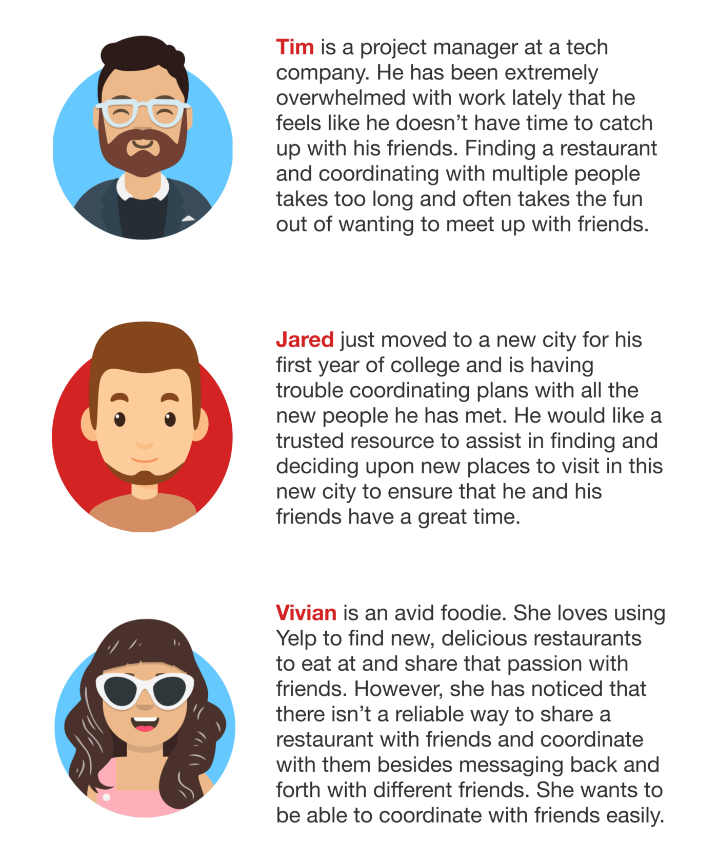
The Breakdown: Each of the individuals live very different lives, but face the same problem when it comes down to making plans: there is not an interactive way for group members to share and agree on a place to eat at. With no consistency, this process can eat up valuable time and cause users like Tim to shy away from making plans with groups.
Ideation
Based on the user research and personas the team arrived upon the problem statement of “friends need a more efficient and engaging way to coordinate which restaurant to meet up at and eat out together.”
The team knew we wanted to make Yelp more social to engage people to meet up in person. Based on various options on the survey filled out by participants, they were most interested in a poll feature or in-chat reservation. We decided to prototype these features as well as later on after extended user testing, redesign select Yelp messaging visuals to streamline the group’s ways of connecting and sharing restaurants. This was so users would not be clicking and searching around Yelp to find what could easily be shared and viewed with a single tap.
UX Flows
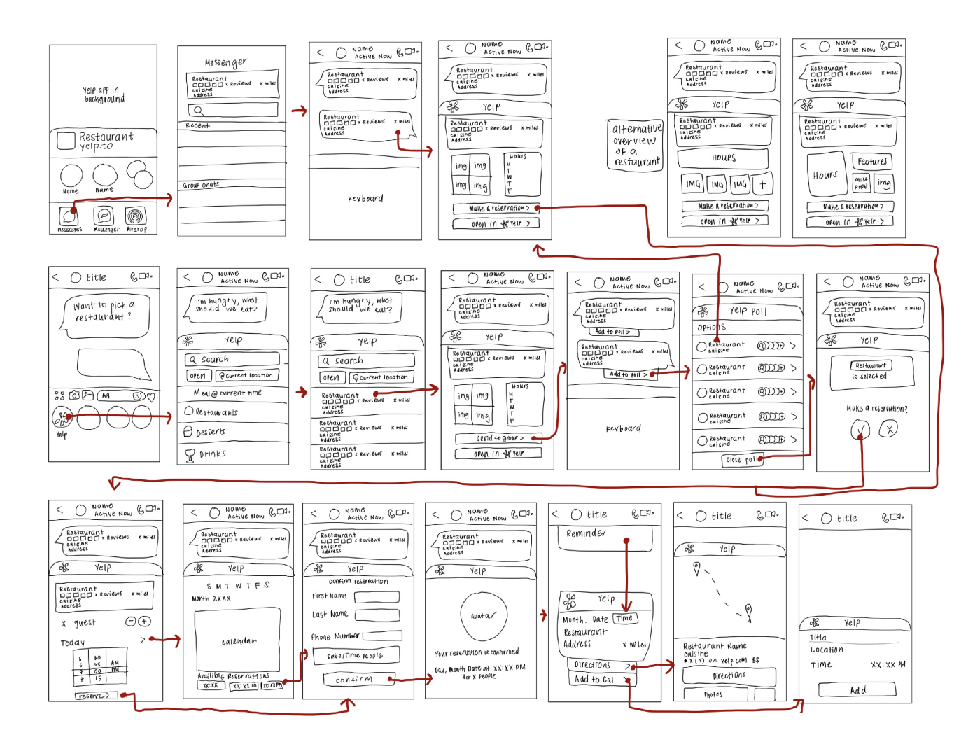
To start, the group curated two separate UX flows for two ideas: a poll or in-chat reservation. Through this, we would be able to test them against each other and decide which one to iterate on based on user feedback.
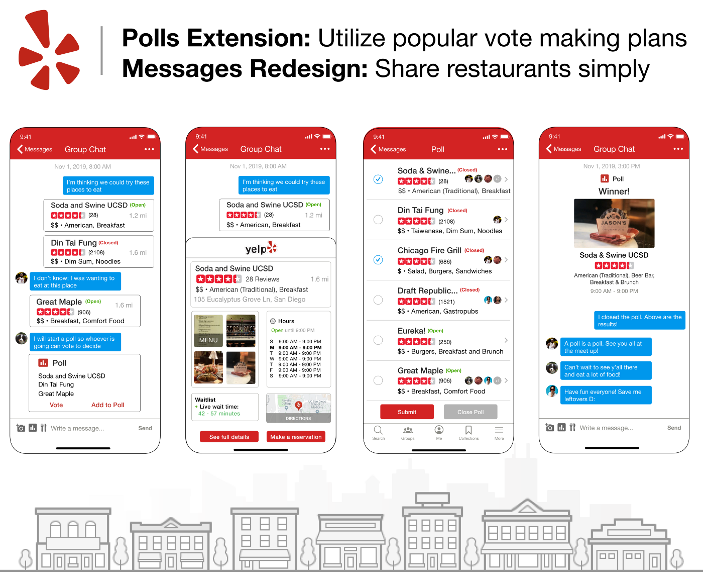
Flow 1: Group Chat Polls
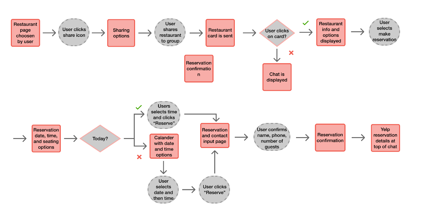
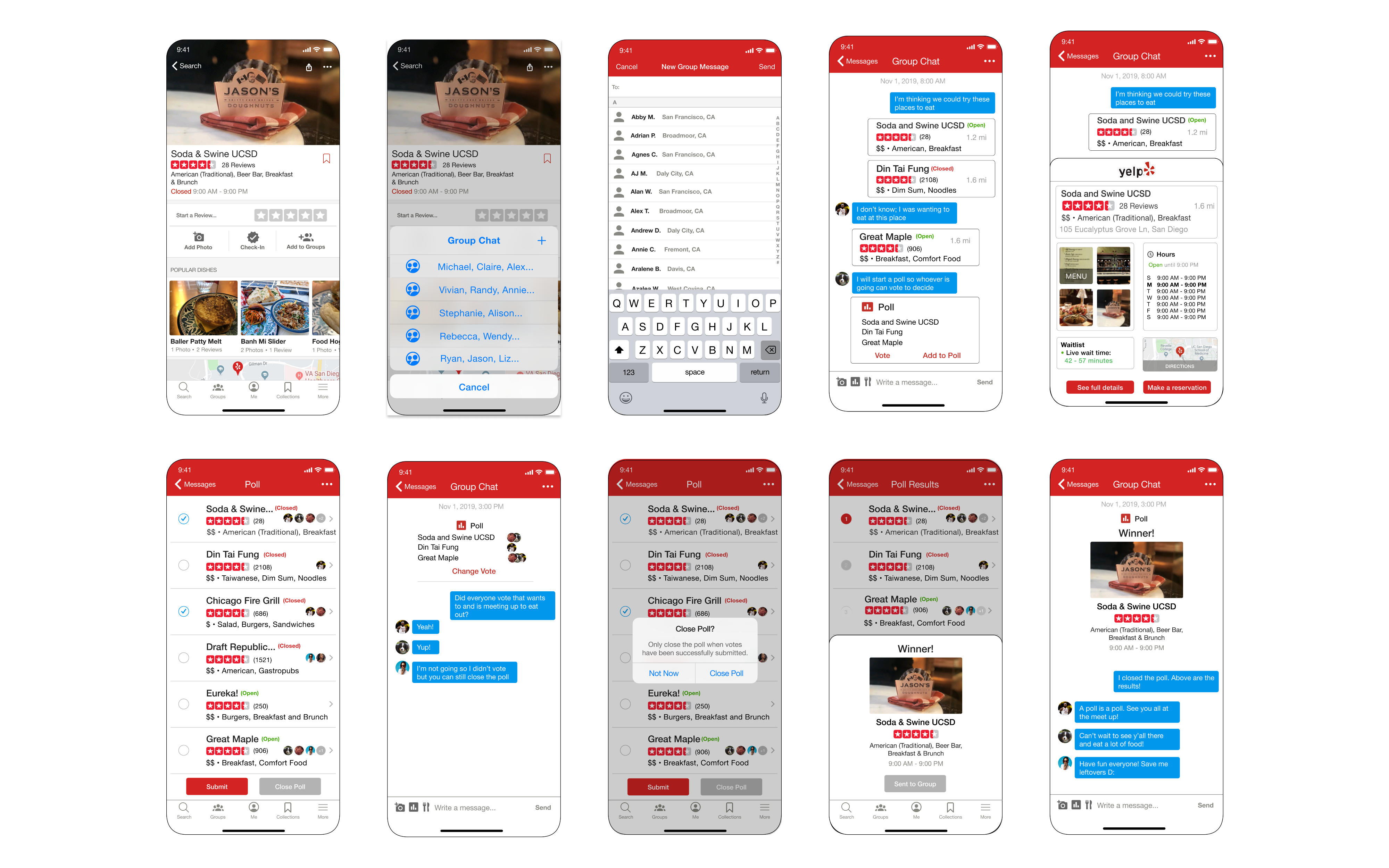
The entry point for this UX flow is the Yelp page that is chosen by the user already. From this flow, users can easily share the restaurant they found to group chats in Yelp and from that point make a reservation. Then, the whole group can view the date and time.
Flow 2: In-Chat Reservations
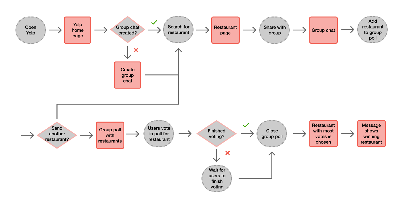
The entry point for this UX flow is opening the Yelp app. From this flow, users can create a group and add people that they wish to eat together with. They can then find restaurants and add them to a poll. Everyone can vote for different restaurants on the poll. When finished, the restaurant with the most votes “wins” and everyone can see the result.
Prototyping
Low Fidelity Prototyping + User Testing
We created rough sketches based on the UX flows and the basic appearance of the Yelp application then turned these into two paper prototypes for the two user flows to be able to test users with.
Before moving onto high-fidelity prototyping, the team wanted to decide which UX flow to stick with: Group Chat Polls or In-Chat Reservations. Through low-fidelity model prototype user testing among participants ages 18–65, I compiled the pros and cons of the design overall as well as for the two user flows.
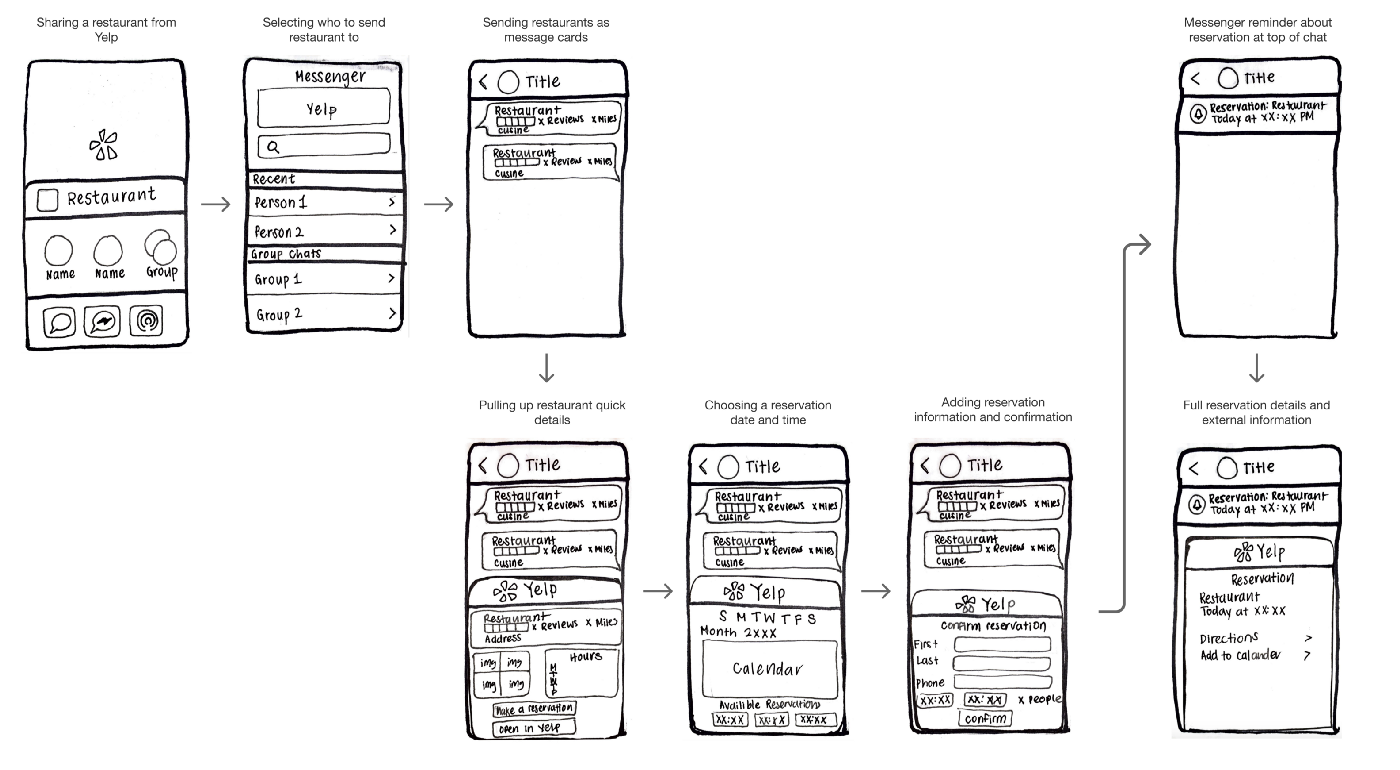
Flow 1 Prototype: In-Chat Reservations
Feedback
+ [Reservations + Design] Users enjoyed the easy reservation option and mused that the design was similar to Yelp and Messenger but remained equally sleek and simple. They also liked the messaging cards.
— [Sharing] Users were confused about whether the Yelp message cards were either clickable or simple, static messages. They also were not quite sure how the sharing in the new iPhone OS worked.
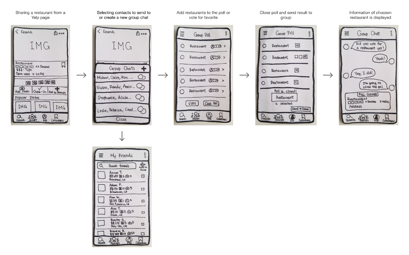
Flow 2 Prototype: Group Chat Polls
Feedback
+ [Polls + Design] The UI overall was intuitive and polling with friends was useful. The user wished they had the reservation function in Flow 1.
— [Polls] Users were confused about whether every person in the group chat was required to vote before closing a poll and who could close the poll.
Overall Feedback
+ Users were interested in aspects of both Flow 1 and Flow 2.
— The functionality of these Yelp messenger features was not useful to non-Yelp users and the design was sometimes confusing to non-iPhone users.
Based on the feedback for low-fidelity prototypes of Flow 1 and Flow 2, I interpreted that the team was able to successfully design and bridge the two most wanted features users were interested in from initial user research and overall make the user flow intuitively. The only caveat ended up being that buttons were slightly unclear so it required more users thinking about what they actually have to click next or they clicked the incorrect button.
For the future design process, this meant the group would have to edit buttons to make use of more arrows to make where to click and what is possible more intuitive.
Moving forward to high-fidelity prototyping, the team decided to go with Flow 2 because it was most popular among the initial user research (at 38%). To retain some aspects of Flow 1 that users enjoyed, we copied over the clickable cards and restaurant overview feature into Flow 2.
High-Fidelity Prototyping

We curated high fidelity screens based off of user Flow 2 and aspects of Flow 1 and the design also came from the nature of Flow 1.
Visual Design
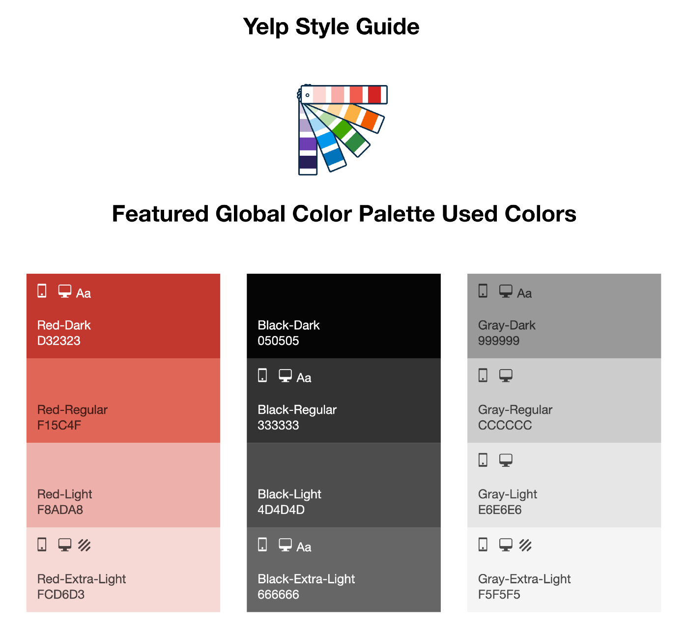
Global Color Palette Usage
We colored every app screen based on Yelp’s Global Color Palette. Additionally, throughout the design process, I utilized the Style Guide.
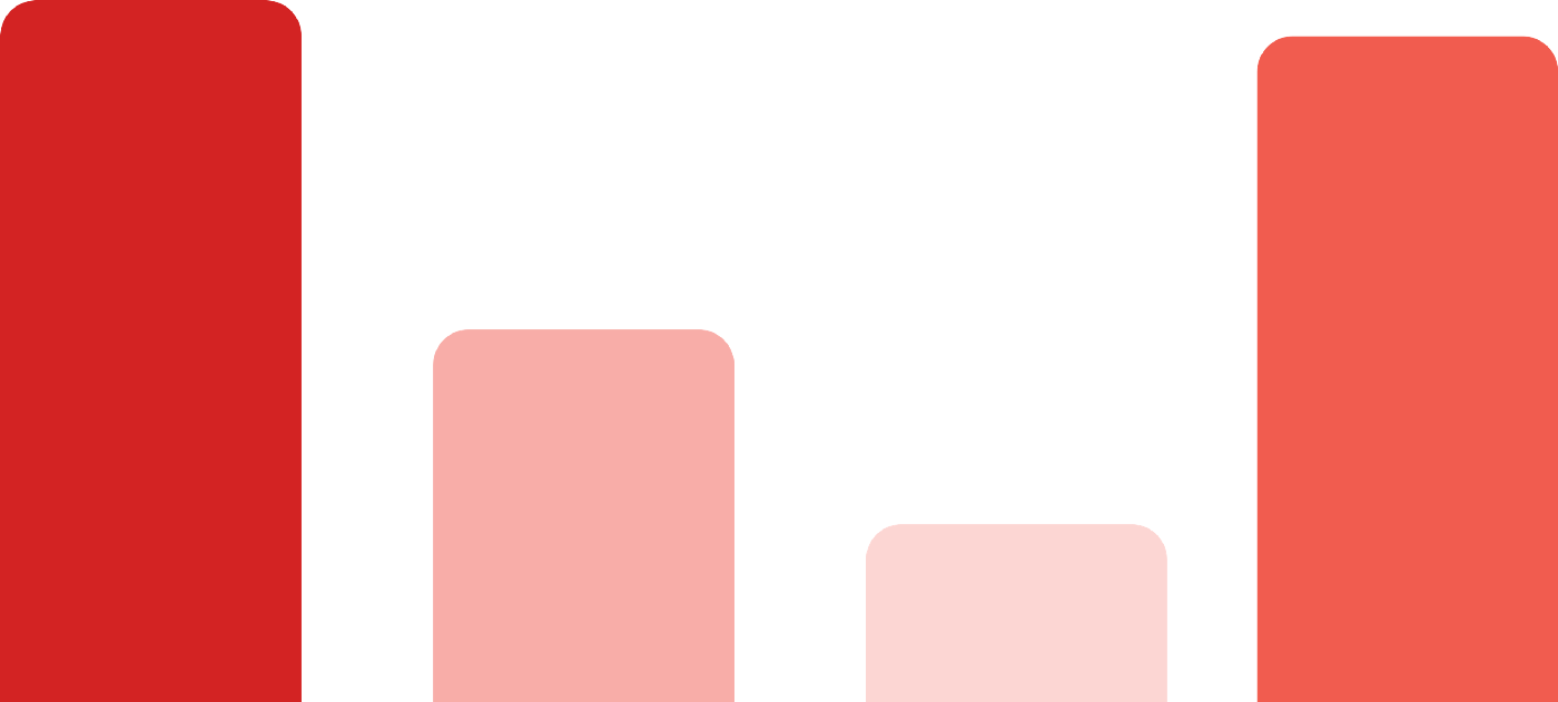
Graphs
The four shades of the graph for users match the Global Color Palette and uses the symbolism of the darker shade of red = higher number.
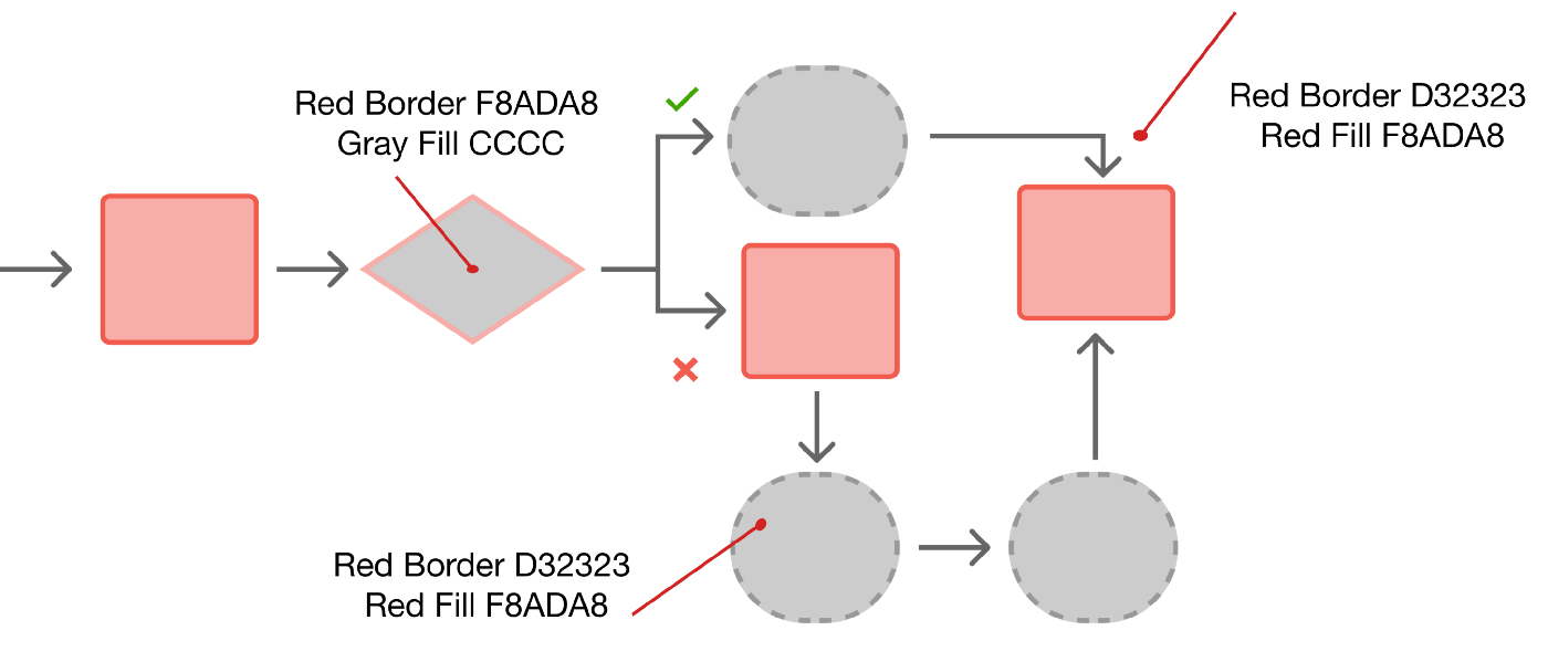
UX Flows and Pointer
I had the UX flow box fills and outlines be the correct colors to match the theme. Even the checkmark matches using Green 41A700 and the pointer used to compare is Red D23232.
Survey
I made the survey Red D23232 but I think Google Forms mutes the color down.

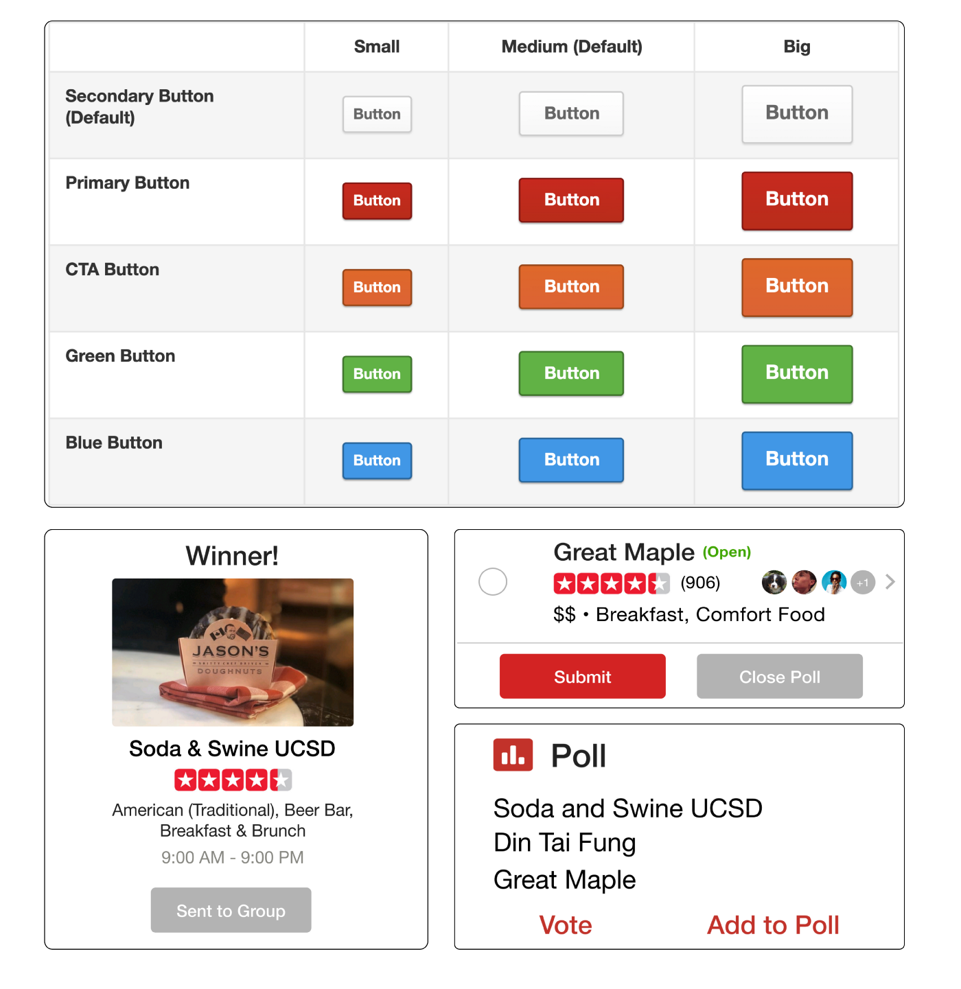
Button Design
The team modeled the buttons after the Primary and Secondary buttons on the web version of Yelp.
Typography
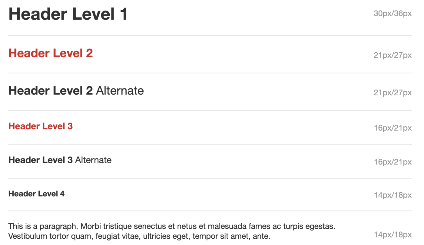
All Yelp fonts are in varying degrees of Helvetica Neue.
Design Decisions
Throughout the design process, we also iterated on several different ideas of design choice based on user feedback after high-fidelity prototyping.
Comparison 1: Poll Winner
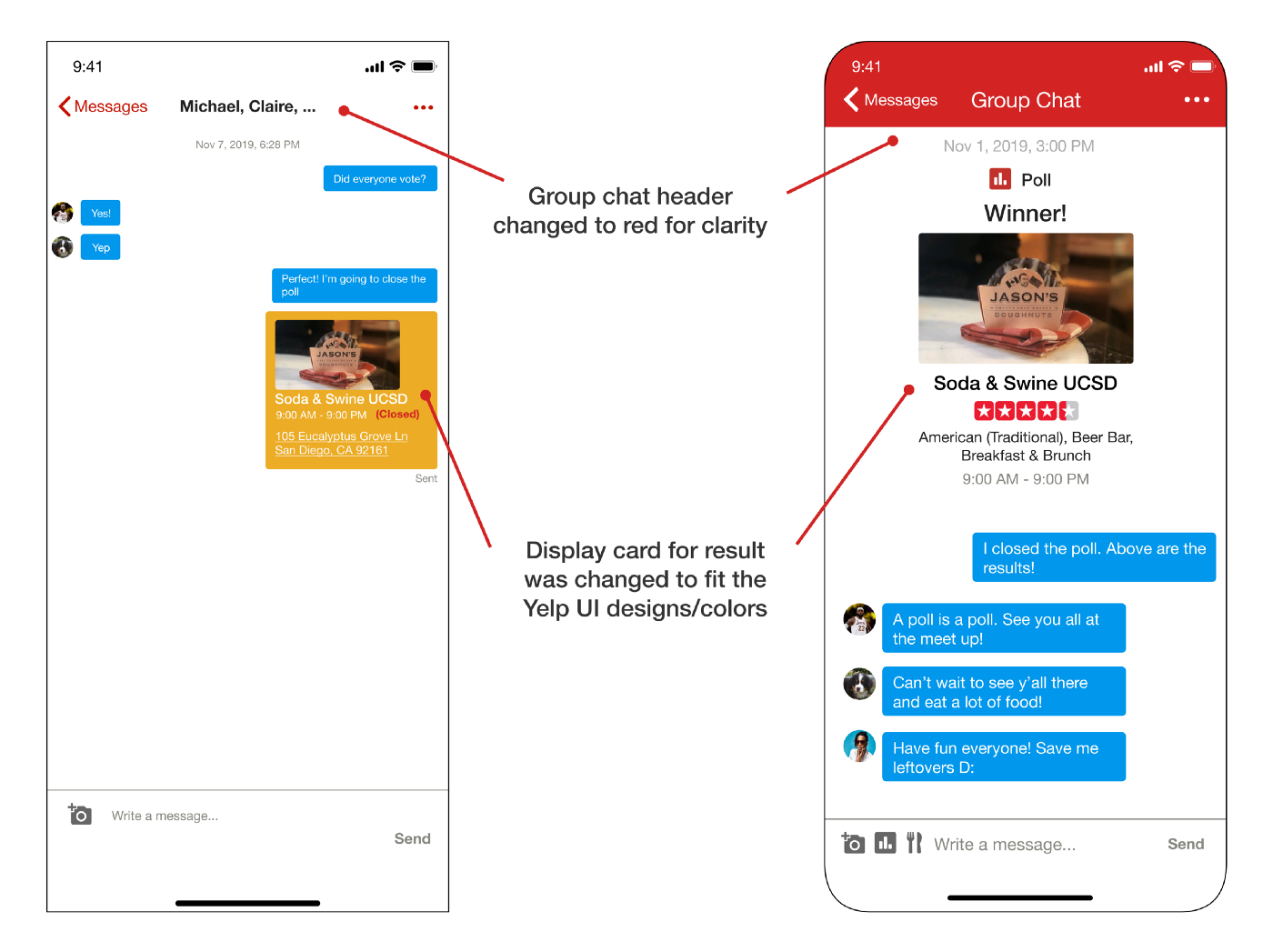
Before: For the previous prototype for the Yelp messenger, we simply copied the UI of the current Yelp messenger screen.
We noticed Yelp’s user interface messages were rather small and their messenger system overall did not look very “Yelp-like”. Additionally, while our poll winner message card matched the theme of a message, it did not emphasize the effect of the poll feature we implemented.
After: I decided it would be best to redesign the messaging overall to be more “Yelp-like” and to center the poll winner and enlarge it. I added a red header to the top to match Yelp searching and home page features as well as enlarged and centered the poll winner display card.
Comparison 2: Close Poll Alert
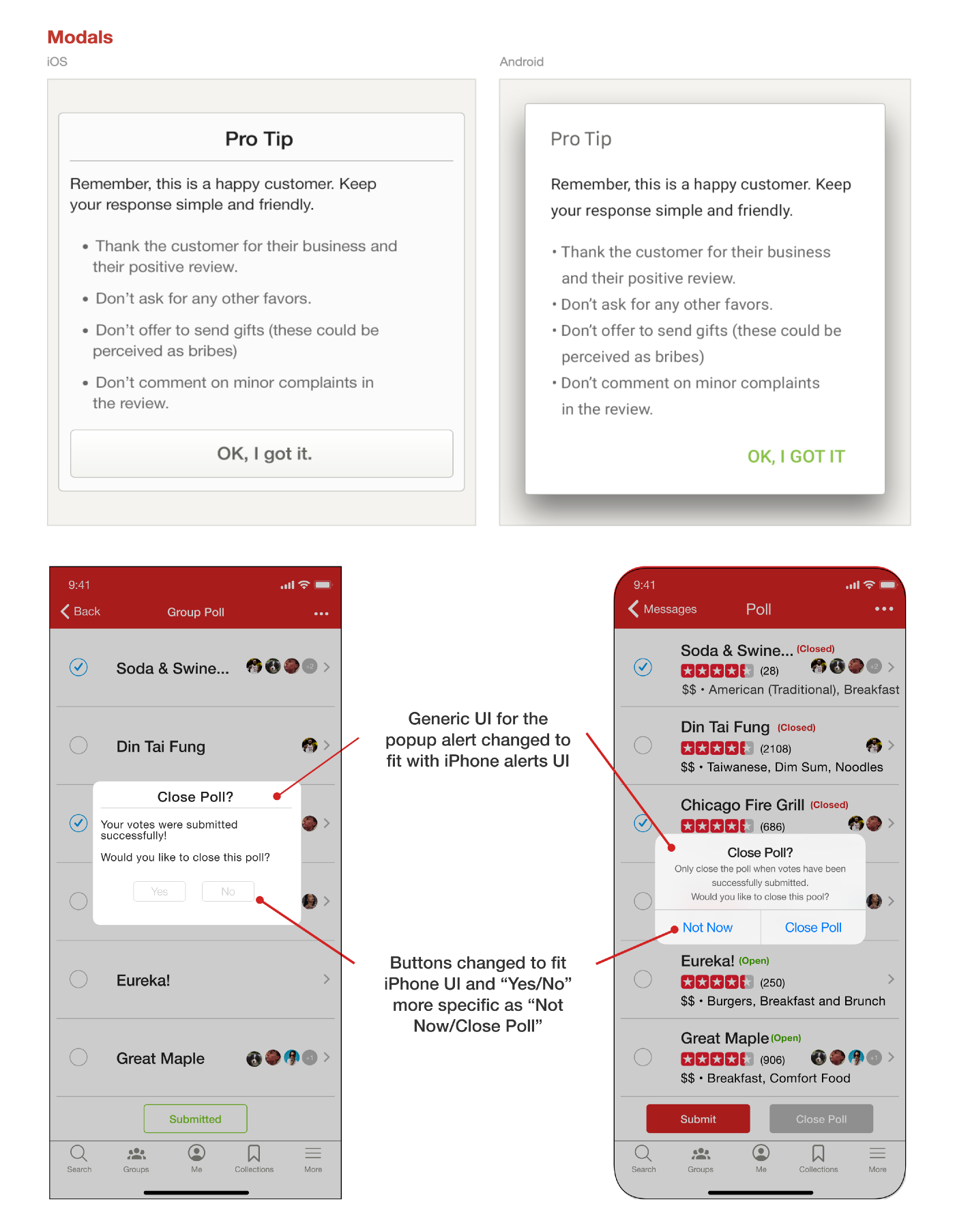
Before: The popup we made for the previous version is not matching the UI/designs of iPhone alerts but did match that of Yelp Style Guide.
After receiving instructor feedback from the classroom regarding the design of the popup screen, we decided to redesign the popup. While it is not as close to the original Yelp design of buttons and modals, it matches the iOS experience better and does not detract from the readability and functionality of poll closure.
After: In the new version, the team took the same style of alerts on iPhone and adjusted it to what we need. The wording in the popup alert has also been changed to make it more clear for the users. Instead of asking again if users wanted to close the poll, we wanted to make sure that the user knows everyone has voted already and then they can close the poll.
Comparison 3: Group Chat CreationBefore: In the previous design of the group message start design, we chose the iOS style of starting group chats with the blue buttons.
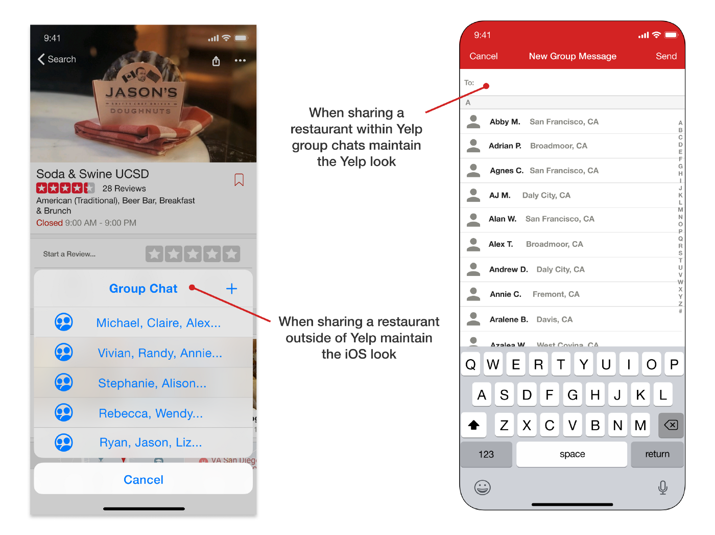
Before: In the previous design of the group message start design, we chose the iOS style of starting group chats with the blue buttons.
It made sense since this was with the iPhone, however; it kind of lost the “Yelp-like” quality of group chats. When sharing restaurants, users are used to the iOS interface of blue cards and sharing. However, Yelp has its own design of selecting contacts to message. Instead of having one or the other, we decided having both is best. First, users would see the familiar group chats to select. If they wanted to create a group chat using the + symbol, they would be brought to the Yelp style of messaging contact selection.
After: We integrated the same group chat messaging features of iOS with the look of Yelp (designed) after their single message starters. While the Yelp look was a little more clunky-looking, we made a good mix of both iOS and Yelp design.
Final Result
Taking in the final tidbits of advice from users and the class instructors, we polished up the interfaces and made polls a little more interactive and easy to read.
A final user flow would go as so: User picks a restaurant -> User shares restaurant -> If they do not have a group chat they will make one -> Restaurants are sent as clickable cards -> when clicked on the cards show an overview of the restaurant that can be swiped on to close -> Restaurants can be added to polls and voted upon by group chats -> Upon poll closure the results can be sent to the group and displayed.
Reflection
I am really proud of extending this Yelp polls message feature and improving the design of sharing restaurants through clickable cards and restaurant overviews! This was my first project of its kind and I learned a lot from working alongside and being critiqued by designers. Looking back, I learned a lot and contributed by spearheading a significant amount, especially for my first project of its kind.
I Learned
Figma: I had never used Figma so learning how to mock ideas upon it, collaborate with others, and make components (very efficient) was useful. In the future, I hope to learn how to animate on Figma.
UX Flows: I did not even know where to start on UX Flows but it makes sense as it is how a user interacts step by step with special attention to what they could accidentally do if the flow or buttons are not clear enough
User Research: Because of users the base of products, of course, research should be done for what they want. At first, I wanted to simply go with an idea I had but learned to design for users and based on feedback is more effective.
My Role
I have always wanted to change apps like Yelp but until I never felt empowered to do so until now. I was deeply engaged in the creative process and had a lot of fun. Reflecting, some unique contributions to the aspects of the project were:
User Research: Instead of just one method of user research I elevated to three and was able to assure quantity through mass survey distribution and quality through multiple interviews.
UI + UX Flow + Prototyping: In my excitement and haste, I drew out 20 sketches on my iPad (shown below but not relevant) of what I thought the extension would look like but it kind of jumped the gun in the thinking process. As a team, we took a step back and split it up but a lot of the look and feel of the extension was based around my ideas.
UX Flows: Taking a step back, I had a lot of fun learning how to create user flows and imagining being the one using it for the first time to make it user-friendly.
Low-Fidelity Prototyping: I turned these sketches on the screen to one of the user’s flows of real “clickable” papers. It was interesting to see the user’s contacts with the paper “screens.” I articulated the user testing point-of-view and from that analysis decided what the next steps of the design were.
High-Fidelity Prototyping: I created alternative screens than by the team’s to give two points of view as well as different identities and features a single screen could hold. It was interesting to compare the possibilities of the same idea with a different design.
User testing: I then tested the screens on two users and polished them to not only fit the standard iPhone X format but also was able to make use of the user feedback to clear up any misconceptions or confusion the previous screens had caused.
Redesign: This part was a bit of a happy accident but I noticed Yelp messages design was not very “Yelp”-looking so I redesigned the header as well as the messages to make restaurants clickable cards.